


Kitsune Fabric Information
- Pitchers Boutique

- Jan 31, 2024
- 3 min read
Updated: Feb 11, 2025

I have never had so many emails, messages or comments asking me about the fabrics I used for a certain pattern; like I have with the Kitsune pattern. I have to say this was one of the patterns I really wanted to make, but felt like it would not be popular. I love unique things, different and weird or out of the box creatures so I wasn't sure many people would like the idea or the design of the Kitsune. To my surprise it has been received with open arms and an abundance of love. I can’t even believe how many people have told me how it looked more like a piece of art than fabric.
When I design a pattern my main goal is to always make the pattern/design look like an actual image. I always try to achieve the realistic aspect of the design. Like I have said in the past, the eyes are usually where I focus a lot of the details because the eyes are the soul to the piece. I feel like if you can get the eyes just right, then the rest of the piece falls into place.

I spent weeks on this Kitsune pattern.
I did some drawing on procreate with it, and changed a few things, and added some stuff as well. In the end after a few days of drawing and creating the perfect Kitsune, I had what I wanted.
I then spent more weeks than I want to admit, designing, and redesigning this pattern. I would do something then redo it, and then look at it and think nope thats just not right. I changed the colors at least 5 times. At one point I had a more white/silver style Kitsune. I did my traditional all black with red, all black with teal and tried all black with purple. I disliked them all. Which for me was unusual because if you know and have learned from my previous designs I like having dark or mysterious things. Like my dark unicorn or my thestrial. I love dark animals and have even designed a few that have not become of anything, but maybe one day they will. I just never really felt like finishing them. (Yes, I have a ton of those).

Eventually, I started to play around with the whites, silvers and a few random colors. I eventually ended up using the traditional fox color of orange and white, but adding in the purple and blue/teals. I loved the idea that it was a winter ice cold fox and the blues/teals and purples hopefully gave that vibe.
When I landed on the colors that I ended up using I then started to pull fabrics to see which ones gave a decent amount of gradient and eventually ended up with the following:
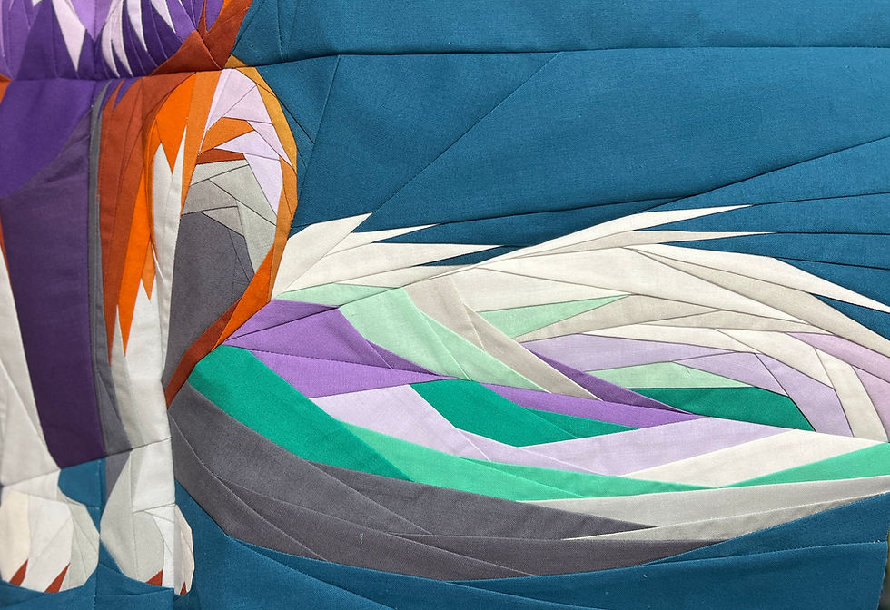
The numbering is based off the 40 inch block Color Indication Page Diagram (Note: these numbers may be different from the 50 inch block as each Color Indication page is unique to each block size).
1.Kona Teal Blue (Background Color)
3. Kona White
26. Kona Black
Blues/Teals (Light to Dark):
5. Kona Sea Mist
7. Kona Ice Frappe
12. Kona Aloha
9. Kona Candy Green
14. Kona Bluegrass
Purples (Light to Dark):
10. Kona Orchid
4. Kona Princess
16. Kona Orchid Ice
2. Kona Wisteria
24. Kona Crocus
13. Kona Heliotrope
20. Kona Tulip
Oranges (Light to Dark):
25. Kona Caramel
18. Kona Gold
8. Kona Amber
15. Kona Kimquat
22. Kona Spice
19. Kona Cinnamon
Silver/Greys(Light to Dark):
17. Kona Dove
6. Kona Quicksilver
21. Kona Lighthouse
27. Kona Shale
23. Kona Steel
11. Kona Metal
Please note this again is using the Color Indication numbers from the 40 inch block, these may NOT be the same with the 50 inch block, hence why I put them in Light to Dark order to help you out.
If you end up making a Kitsune pattern please tag me on social media or use the #pitchersboutique as I love seeing all the amazing quilts and quilt blocks you all make.
Thanks for all the amazing support with this pattern. Hopefully, I can continue to produce patterns like this.
Stay safe and Happy Sewing.
Can you advise on how to calculate the amounts of fabric needed? If a color is listed as used x number of times at 4", what does that translate into in terms of yardage?
Thank you for this Kona fabric list as it sure helps alot to determine what is the light to dark order to help out and learn from it.
Will you be able to list the Kona fabric colors for the silly animals BOM as well if so it would be great as it would be so helpful as I see there are accessories on each animal, I love it as I would love to change the colors into all oranges for each one of the accessories on each animal to reflect my favorite color orange. For the giraffe I will just use one scarf into orange and the others in other colors listed on the photo. Again hope you wo…